Design tips and tricks for responsive emails
“Looks good to me, but so what?"
Beauty may well be in the eye of the beholder but that’s not always how it works when you’re looking at a marketing email, especially if maximising the email's impact is the ultimate measure of beauty. If so, then you need to ensure that at the very least it presents consistently to your subscribers and customers, otherwise this can then impact on the effectiveness of the email content.
Just because an email looks good on your phone or PC, don’t assume it looks the same on someone else’s device. Viewing emails can be a vastly different user experience depending on the device you are using, be it a desktop PC, laptop screen, smart phone or tablet. With such a diverse range of email clients in circulation, it is almost impossible to have your emails render identically (look the same) on all of them, and in reality, you don’t need to. Focus your efforts by looking at your internal analytics regularly and identify the primary mail clients that your subscribers engage with.
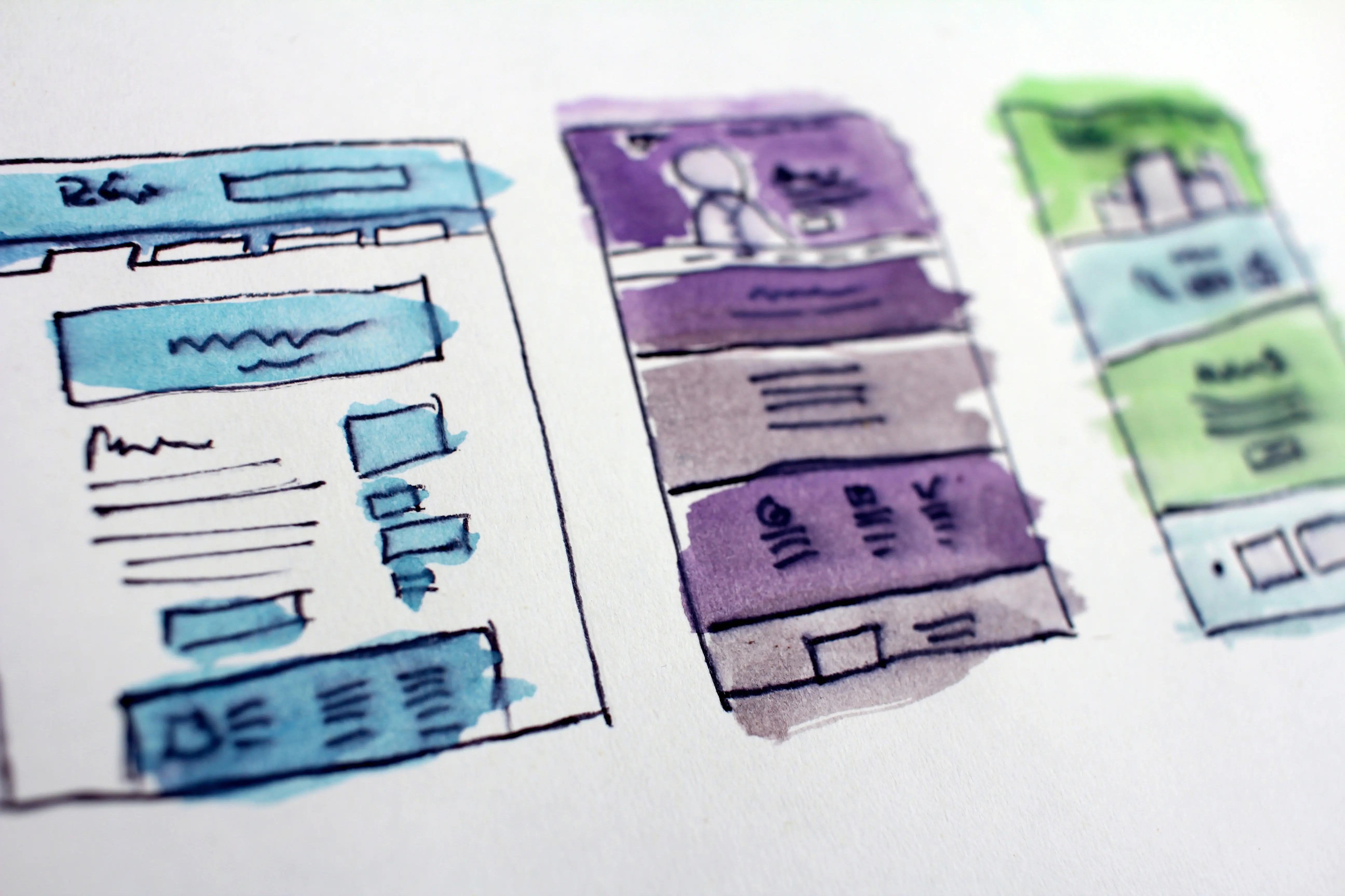
Email templates require different coding and content to ensure they display appropriately depending on the device and email client they are viewed on.
Some basic rules that may help you maintain consistency across devices:
Use mobile appropriate images for mobile, and desktop images for desktop viewers. For example, a mobile banner image may contain a succinct message due to a smaller screen. A desktop computer doesn’t have the same problem, so the image could contain more words.
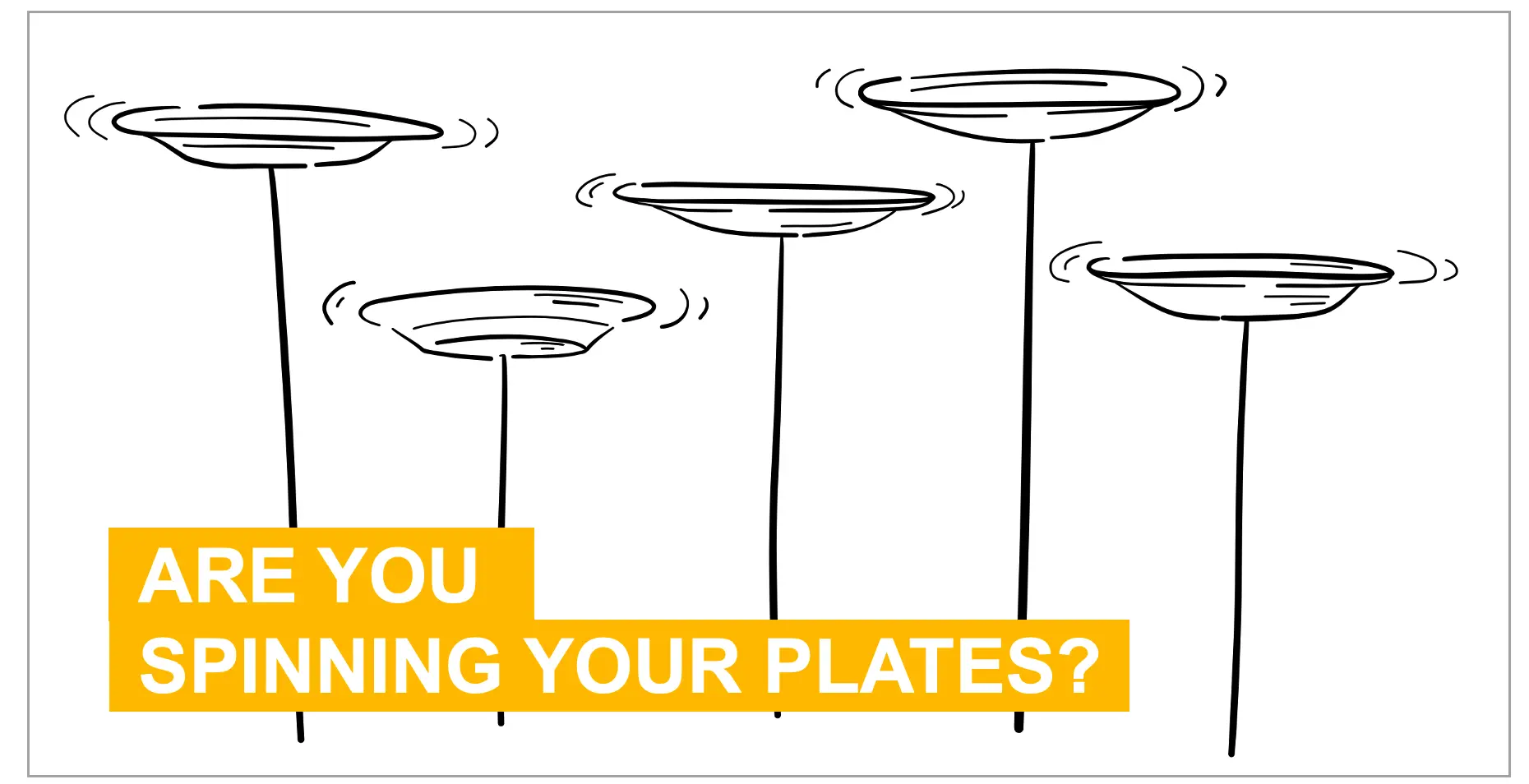
Design for mobile first – Given that more than 50% of emails are initially opened on a mobile device and that a mobile friendly design will usually look fine on a desktop (the same isn’t true for desktop specific designs viewed on a mobile), it makes sense to make mobile your priority.
Go mobile only - If you have the resources and expertise, create templates that work well in both environments. If you have to pick one for any reason, pick a mobile friendly design as your default.
Test it - Make it a routine to test for, at minimum, the most common devices. In the absence of knowing the specific environments related to your recipient audience, we would recommend starting with these:
Mobile - iPhone, iPad, Android
Webmail - Gmail, Outlook.com, Yahoo! Mail
Desktop - Apple Mail, Outlook 2016, Windows Live Mail
Email client testing
Make sure you know how your email renders (looks) on the major email clients (e.g. Hotmail, Gmail etc). While an email may look good in your inbox, it might not look so great for others. You’ll have to test it and see.
How you do this and how often will depend on the email marketing platform you’re using and how old the template is relative to new email clients in the market. For example, Taguchi’s Smart Template® system is a content management environment specifically designed for email creation. This means that the email client rendering rules are programmed into the template modules themselves and don’t have to be tested each time the template is used, no matter how the modules are moved around to accommodate different designs and layouts. This is because you are using the functionality and logic of the purpose-built modules and not manually editing the HTML code. Systems using this type of content management template approach usually only need to be tested when major changes are made to new email client versions or new modules and logic are added to the template
A common approach amongst many other email platforms, particularly older ones, is the use of HTML editing modules where email content is populated by editing the HTML code either directly or via some form of provided WYSIWIG (what you see is what you get) design tool within a pro forma layout (i.e. a template). With these types of systems, even small changes or additions to the HTML as a result of editing content can “break” the email design in certain email clients. This HTML document editing approach usually means that the email needs to be tested for rendering consistency frequently, possibly prior to each deployment depending on the extent of the changes each time.
As a minimum we recommend the following email client testing:
iPhone
Gmail
iPad
Apple Mail
Outlook
Samsung Mail
If you don’t have direct access to a wide variety of native email client environments, then you can use online rendering tools like Litmus to get an idea of what your email will look like.
Online rendering testing tools are useful because they're quick, relatively cheap, and give you a broad spectrum of tests. Many of these are emulating native email client environments and use intelligent screen-capture to replicate what your email would look like in a particular native email client; they're not actually showing you the email in the native email client itself. In our experience there's no substitute for testing email templates in native environments, even if this is done periodically in-line with major email client updates.

Now you see it, now you don't
Many email clients block images in messages either because that's their default setting or because the recipient has configured it that way. This means your important images may not be displayed to the recipient. If this is the case, the readable content of your email such as subject lines, text headlines and body copy have to do the heavy lifting to compensate and entice the reader to override their settings and “display images”. Despite this, there's no guarantee the recipient will load the images leaving your beautiful artwork to live invisibly in the ether. Therefore, the use of alternative text (i.e. alt text) provides a back-up to at least ensure the image message is conveyed when images are turned off.
Therefore, it’s wise to avoid embedding critical messages solely in images by having a fall-back using alt-tags which display even with images turned off.
Even the coolest GIF needs a plan B
As email clients improve and become more sophisticated, we're seeing an increasing use of gif animation as opposed to static images in emails. Terrific, who doesn’t love colour and movement?
Whilst this can improve the recipient experience, not all email clients will display this animation. Some will actually display a still image made up of one of the frames, typically the first frame. Therefore, always keep this in mind and ensure you have an appropriate first frame.
Similar alternative image consideration needs to apply to the use of video in email. It is changing, however currently very few email clients reliably support video. As most don't, make sure you have a relevant still image fall-back. Typically, this image is derived from a frame from the video with a video play button superimposed over it. The image then clicks through to somewhere from where the actual video is streamed.
Below are the email clients that do accept video:
Apple Mail
Outlook for Mac
iOS 10+, Native Client
Samsung Galaxy, Native
Thunderbird
Whilst it may not be possible to cater for every possible combination of email client and device, your template will need to be adapted regularly to cater for the most common environments. Focus your efforts by looking at your internal analytics regularly and identify the primary mail clients that your subscribers engage with. Talk to the team at Taguchi about how we can help you deliver a great multi-channel campaign regardless of device or email client.
Photos by rawpixel.com from Pexels, and Hal Gatewood on Unsplash